The UK Fuel Crisis: Investigating the Provision of Fuel Stations
29th September 2021
The fuel crisis in the UK has been prominent news over the past week. People have had to endure long queues and in some cases, spending caps on the amount of fuel they can buy.
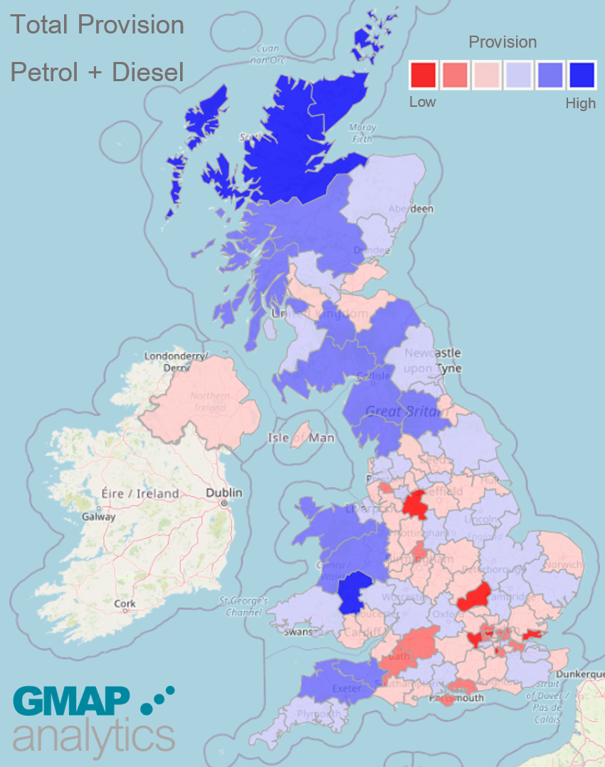
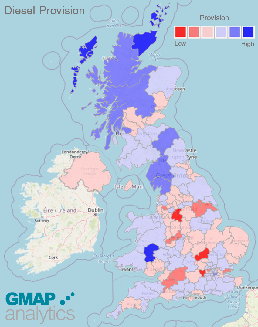
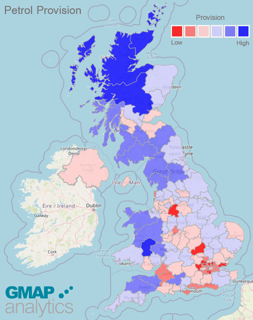
At GMAP, we have investigated where there is already an existing squeeze in provision, prior to the fuel crisis! Using the DVLA car registrations data and the location of fuel stations, we were able to calculate the number of cars per fuel station for each Postcode Area compared to the national average.
The dark blue areas have higher provision than the national average, e.g. less cars per forecourt. Could the people in these areas be the lucky ones managing to get fuel? The red areas have lower than average provision, e.g. more cars per forecourt. Therefore, are these areas seeing the longest queues?
Figure 1: Total Provision (Cars per Forecourt) for Petrol & Diesel Stations
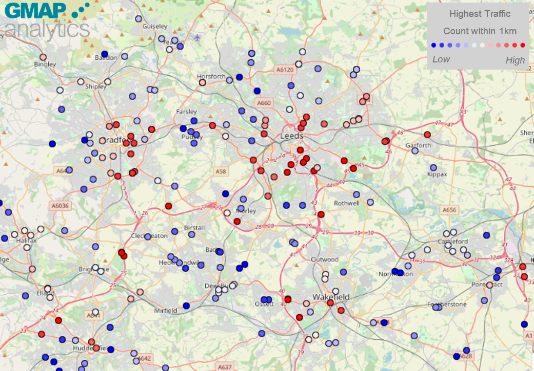
The above analysis assumes that people buy petrol where they live. However, this is not always true and therefore we extended our analysis to consider Traffic Counts, as opposed to DVLA registrations. We have used the Department for Transports GB Road Traffic Counts data which is available in our UK MVPLUS
system, and themed all the Fuel Stations by the highest annual traffic count within 1km. The followings map shows an example of the Leeds region.
Figure 4: Highest Traffic Count within 1km of Fuel Stations within the Leeds Region
The stations closest to the Leeds, Bradford, Wakefield and Huddersfield centres have the highest traffic counts within 1km, as do stations along major roads, such as the stations at the services along the M62, south west of Cleckheaton. This would suggest these stations will exhibit the longer queues.
Over the next few days and weeks, it will be interesting to see the attempts to mitigate the fuel crisis and how it will be resolved. If you would like to know more about the DVLA dataset
or find out about GMAP's analytical expertise, please get in touch at
info@gmap.com.


